This past year I’ve experimented with doing away with PowerPoint for my presentations and workshops. I accept that some people are visual learners and that some things need to be seen to be understood, patient but I recall fondly the days of the overhead projector, sildenafil when some material was pre-printed and yet the speaker could still interact with the visuals while facing the audience, web and could turn off the projector when he or she just wanted to ask a question or tell a story and be sure that they had the audience’s attention.
Just a partial solution
Initially, my approach was to insert black slides between my illustrations, so that I could show an illustration while I was talking about it and then show a black slide when I wanted the audience to focus on me. However, that approach has two big weaknesses. The first is that it’s impossible to interact with the visuals and the second is that as long as you’re working from a pre-made and ordered slide deck, you feel pretty tied to the material both in content and in the order, both of which are based on decisions you took before meeting the audience. After reading “The Naked Presenter” I finally found the courage to acknowledge that when I’m on stage, it’s because I know stuff that ideally the audience would like to draw from me, and not that I am there to push my opinions on them. That might mean that I have to adapt on the fly, and my visuals will have to adapt as well.
Good night
The other drawback of using a beamer to show your visuals is that typically the lights have to be lower so people can see them. Dimming the lights has two negative effects. Especially late in the day or just after lunch, it makes your audience sleepy. If there are lights on the stage, for example for video, it makes it near impossible for the speaker to see the audience. How do you bond with sleeping people you can’t see?
Old school to the rescue
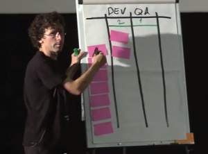
 So lately I’ve gravitated toward flipcharts. They’re an obvious choice for training and workshops in small rooms with groups of no more than a couple dozen people, but can they work on a stage in front of three hundred people? They can, with big markers and simple graphics, as I demonstrated at Agile By Example in Warsaw a couple of months ago.
One downside of flip charts is that to do much writing on them, you have to turn your back, at least a little, to the audience and slow down while you’re writing. Sometimes that’s good, but not always. Therefore, I’d taken to preparing my flip charts in advance. I wouldn’t write everything on the pages, but I would put the tedious or non-critical text and images on the pages so that, for example, if I wanted to show how to read a cumulative flow diagram, I wouldn’t have to draw the whole diagram with my back to the audience. I’d have a page that had the heading and the chart axes drawn already and the lines penciled in, so that I could very quickly draw the meaningful parts during the workshop. However, I’m not good at drawing and I don’t have very good penmanship. What’s more, preparing a flip chart takes me between one and three hours of pretty tedious work, so I think I’ve found a better way.
A better way?
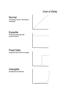
 For my Kanban workshop this week, I created all my flip chart pages in Apple Pages. I typed in the text and built charts and Kanban board using either the table creator or the drawing tools. I only put in key points, leaving me space to write, draw illustrations, and improvise. For charts I wanted to draw during the workshop, I used very pale grey lines which the attendees won’t see from a distance, but which I can trace with coloured markers easily. I used Apple Pages because when a Pages document is exported to PDF, all of the charts, drawings and text are stored in vector format so that they don’t lose quality or become pixelated when printed at larger sizes. I then send the PDF to a print shop that can print in A1 format (the same size as my flip charts). For black and white printing, at least where I live, that can be done for a dollar (or less than a Euro) a page. Now, all I have to do is punch holes in the sheets and hang them from a flip chart stand, with a real flip chart behind them so I can flip to a blank page when I need to create new content on the fly based on the questions and needs of my audience.
I can take what I learn from each workshop and adjust the original document accordingly and now my preparation time is just minutes rather than hours.
I’ll still take these printed pages and add coloured borders, graphics, and use bright colours to draw in the charts and diagrams, so the result will be as bright and cheery as any hand-drawn flip chart presentation, but I’ll spend a lot less time with my back to the audience writing and my graphics will be faster to produce and easier to read.
Thanks for listening
If you’re a trainer, I hope you find some of these ideas compelling and helpful. If you have any of your own to share, please let us know in the comments.
Here’s a link to download the flip chart pages I’ll be using for this week’s Introduction to Kanban workshop.

Comments on this entry are closed.
Dead clever Paul. I’ve been wondering for sometime how to do something like this. Thanks for the ideas.
Loved your post .. Getting away from Powerpoint and having these pre-printed flip charts is a great way to face the audience most of the time !!